TAKK Kombucha | Brand & Packaging
SOBRE / About
-
Takk é uma indústria de kombuchas localizada em Cascavel, no oeste do Paraná. Takk significa "obrigado" em norueguês, e produzir essa bebida milenar é a forma da marca
celebrar a vida e demonstrar gratidão ao universo. Criada em 2019, hoje a empresa está presente em mais de 30 pontos de venda em todo o estado.
Takk is a kombucha producer based in Cascavel, in western Paraná. Takk means "thank you" in Norwegian and producing this millennial drink is the brand's way of celebrating life and showing gratitude to the universe. Created in 2019, today the company is present in more than 30 points of sale across the state.


CONCEITO / Concept
-
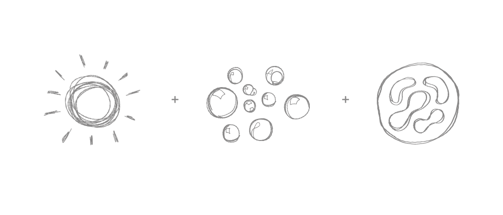
Conhecida como "bebida viva", kombucha é um chá fermentado e naturalmente gaseificado. É um probiótico, antioxidante e rico em vitaminas. O símbolo da marca surgiu a partir da junção de três elementos: o Sol, representando energia e vida; as bolhas de gás provenientes da fermentação do produto; e a colônia de bactérias (scoby), elemento essencial para produção da bebida.
Also called a "living drink", kombucha is a fermented and naturally carbonated tea. It's a probiotic, antioxidant and rich in vitamins. The brand symbol emerged from the combination of three elements: the Sun, representing energy and life; the gas bubbles that result of the fermentation of the product; and the colony of bacteria (scoby), an essential element for its production.


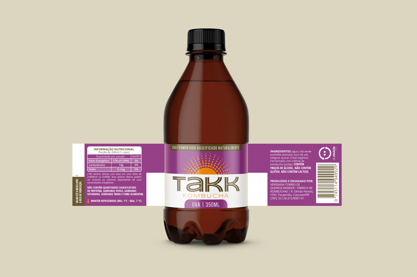
RÓTULO / Label
-
O padrão de rótulos dos produtos leva o nome da marca em primeiro plano, diferenciando os 6 sabores por cores. A paleta de cores é vibrante e energética, sempre contrastando com o sol, símbolo da marca.
The product labels have the brand name in the foreground, differentiating the 6 flavors by color. The color palette is vibrant and energetic, always contrasting with the sun, the symbol of the brand.
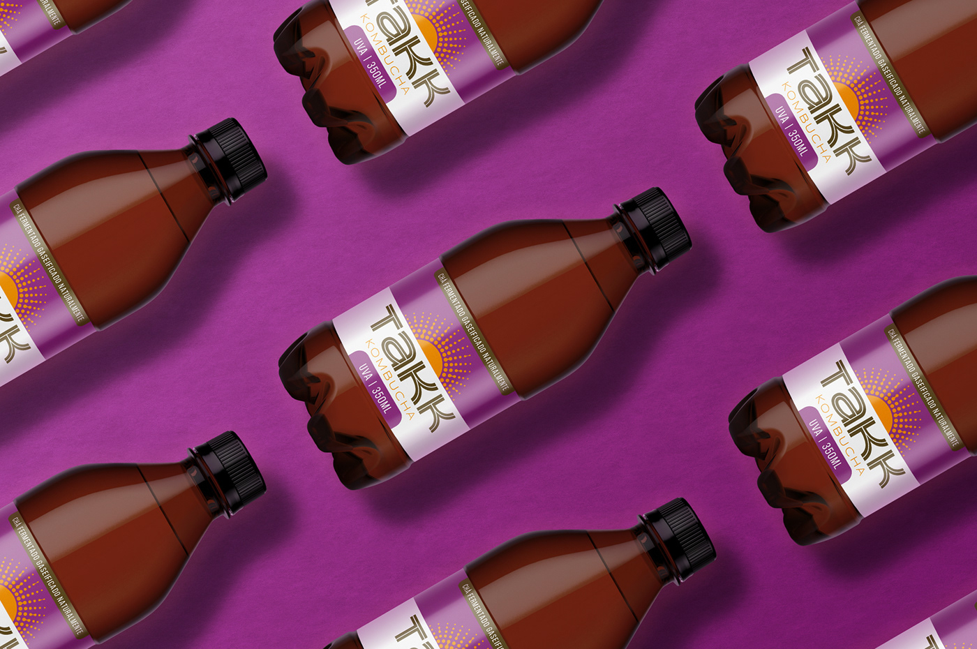


COMUNICAÇÃO / Communication
-
Toda comunicação da marca é limpa e vibrante, utilizando cores quentes em contraste com o branco. Além da identidade visual e rótulos, foram desenvolvidos um catálogo para lojistas, peças de PDV e o website institucional.Brand communication is clean and vibrant, using warm colors in contrast to white. A product catalog, a display for the point of sale and the institutional website were also developed.